The Lexicographer’s Keepsake: How Typography Shapes Bookmark Aesthetics
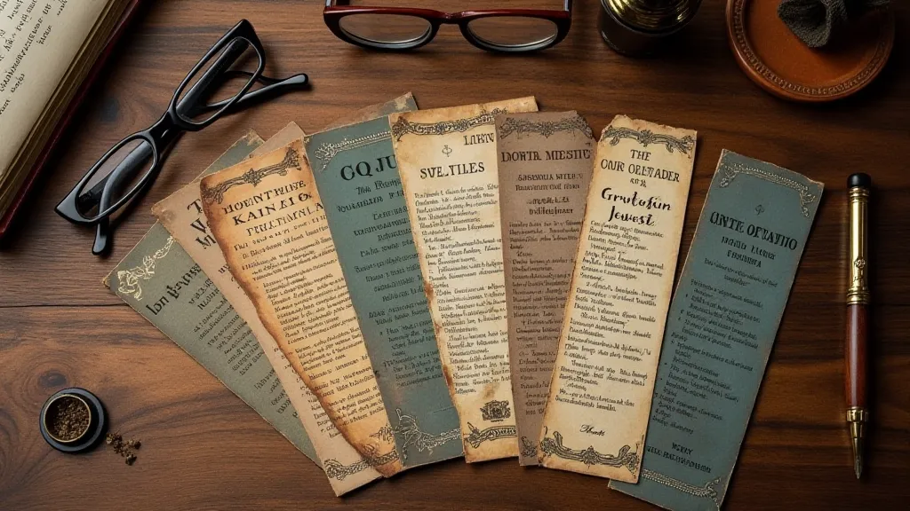
There's a quiet intimacy in holding a vintage bookmark. It's more than just a marker of a page; it's a portal to a past reader, a whisper of a time when books were cherished objects, often handled with more reverence than the devices we hold today. As a collector, I’m less interested in the story within the book, and more focused on the artifacts that accompanied it – the pressed flowers, the faded newspaper clippings, and, of course, the bookmarks. But what truly captivates me about vintage bookmarks isn't just their age or rarity; it’s the way typography breathes life into their design, telling a story as compelling as the words they safeguard.
My fascination began with a chipped, Art Deco bookmark I found tucked inside a first edition of “Wuthering Heights.” The typeface – a strong, geometric sans-serif reminiscent of Futura – immediately arrested my attention. It wasn't merely a font; it was a statement of the era’s optimism and forward-thinking design. It conveyed a sense of industrial progress and a newfound freedom in artistic expression. That single bookmark sparked a lifelong pursuit, a journey into the nuanced relationship between type, design, and the cultural context in which they flourished.
Before the rise of mass production and digital printing, bookmarks weren't disposable items. They were often handcrafted, utilizing techniques like lithography or intaglio printing, processes that demanded precision and artistry. This dedication to craftsmanship is reflected in the quality of the typography itself. Consider the difference between a hastily typeset advertisement and a carefully designed invitation; the latter speaks of importance and respect, qualities inherent in many vintage bookmarks.

The Evolution of Bookmark Typography
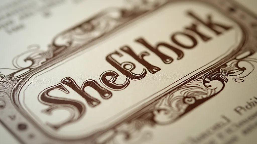
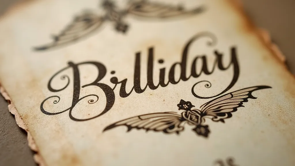
Tracing the evolution of typography in bookmarks reveals a fascinating reflection of broader stylistic trends. In the Victorian era, ornate, serif fonts like Caslon and Didot reigned supreme. These fonts, with their delicate serifs and strong contrast, conveyed a sense of tradition, refinement, and scholarly pursuit. Bookmarks from this period often featured flowing script fonts mimicking elegant handwriting, adding a personalized touch. The prevalence of elaborate, almost baroque typography mirrored the Victorian love for ornamentation and a heightened sense of drama.
The turn of the century saw the emergence of the Arts and Crafts movement, which championed a return to handmade goods and simpler designs. Bookmarks from this era embraced more organic and less ostentatious typefaces. Fonts like Jenson, with its humanist roots, became popular, reflecting a desire for authenticity and a rejection of industrial excess. The move away from overly ornate designs marked a shift in aesthetic values, emphasizing functionality and a connection to nature.
The 1920s, as my “Wuthering Heights” bookmark so beautifully illustrates, witnessed the rise of Art Deco. Geometric sans-serif fonts, characterized by their clean lines and streamlined forms, captured the spirit of the machine age. Bold and impactful, these typefaces embodied the optimism and energy of the Roaring Twenties. The application of this style to bookmarks was a testament to the era's desire to elevate even the smallest everyday objects to works of art.
The Human Touch: Understanding Font Choice
What’s often overlooked is the deliberate intention behind font selection. A bookmark wasn’t simply printed with the first font that came to hand. Publishers, printers, and even individuals crafting their own bookmarks considered the message they wished to convey. A romantic novel might feature a flowing script, while a scientific treatise would likely opt for a more straightforward and legible typeface.
Imagine a bookmark printed for a children’s book – the font choices will almost certainly be playful and inviting, perhaps a rounded sans-serif or a whimsical hand-lettered style. In contrast, a bookmark intended for a legal document would demand a formal and authoritative typeface, such as Times New Roman (though, of course, its prominence came later). The choice wasn’t arbitrary; it was a considered reflection of the book’s content and the intended audience.
I've encountered bookmarks printed for charitable causes, often using fonts that evoke feelings of compassion and generosity. Others, particularly those produced for theatrical productions, showcase fonts that mimic the style of vintage posters – bold, theatrical, and instantly recognizable. Each font tells a story, adding another layer of meaning to the artifact.

Preserving the Legacy: Collecting and Care
Collecting vintage bookmarks is a labor of love, demanding patience, an eye for detail, and a genuine appreciation for craftsmanship. More importantly, it demands a commitment to preservation. These aren’t disposable items; they are fragile reminders of a bygone era.
Restoration, when necessary, should be undertaken with extreme care. Never attempt to clean a bookmark aggressively; gentle dusting with a soft brush is often sufficient. Storage is equally important; bookmarks should be kept in acid-free sleeves or folders to prevent further deterioration. Direct sunlight and humidity are the enemy of paper, so a cool, dry environment is essential.
It’s also crucial to research the history of a bookmark. Identifying the printer, the publisher, and the period in which it was created can significantly increase its value and provide a deeper understanding of its cultural significance. The typeface itself can be a valuable clue, allowing you to narrow down the timeframe and potentially uncover fascinating details about its origin.
More Than Just a Marker
For me, a vintage bookmark isn’s simply a way to hold my place; it's a connection to the past, a tangible link to the readers who came before. The typography, the paper, the printing technique – all these elements combine to create a small object that speaks volumes about a specific time and place. It's a silent witness to countless hours of reading, a quiet companion on countless journeys of the imagination.
And in a world increasingly dominated by digital distractions, there's something deeply satisfying about holding a beautifully designed vintage bookmark, a small, handcrafted artifact that reminds us of the enduring power of the printed word.


